Are you reading this in your Inbox?
Or scrolling down your RSS feed?
Well today, I suggest you read it on the Journey Jottings website 😉
WHY?
Because we’ve got a NEW website full of eye candy.
If you’d dropped by our website this time last week, this is where you’d have landed –
Plumb bang in the middle of the Introduction page – where we left you to flounder around to see how many of you could find your way to the map product you’d come looking for – Surprise, surprise, through no fault of your own, most didn’t do too well, to the point you’d have to email us to ask just how could you buy one of our products!
Not what you’d call user friendly.
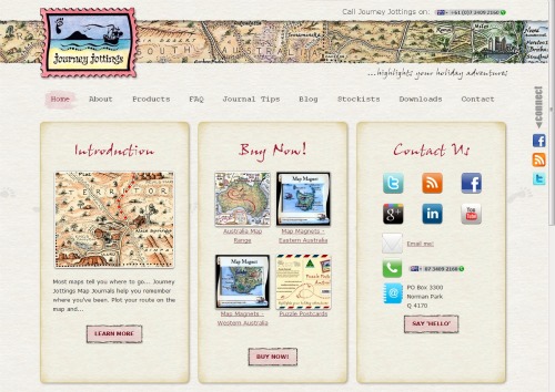
Drop by today and you’re greeted by this navigation panel asking…
- Do you need to know more about Journey Jottings, by way of an Introduction?
- You simply want to cut to the chase and Buy Now!
- Contact us? Here every conceivable contact configuration is a mere click away 🙂
- Or are you after some pointers as to How to Use our Map Journals?
- Want to read our latest post and go straight to our Blog?
- Would like a little more background information About Us?
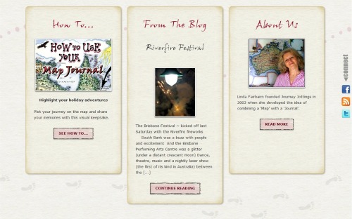
then a roll of the scroll wheel will have you here, in the lower half of the Home page screen.
But back to the poor lost souls who we’d now received pleas of help from via email, we’d give another clue pointing to the ‘maps’ page, where they’d have to scrabble down the mire is search of the Add to Cart button.
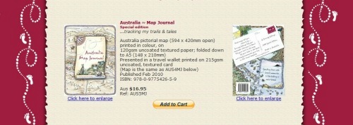
Now – If you’d like to see a few more details about one of our map products we offer a gallery of additional images by clicking on thumbnails – Here’s what the Special Edition Australia Map Journal section looks like:
But more importantly, everything is navigable via the drop down menu bar along the top that’s accessible from every page whether you’re reading a blog post and want a quick click link to another topic we talk about…
 or want to check out another product page –
Last week, this is what you’d have seen if dropping by to read a blog post on our site
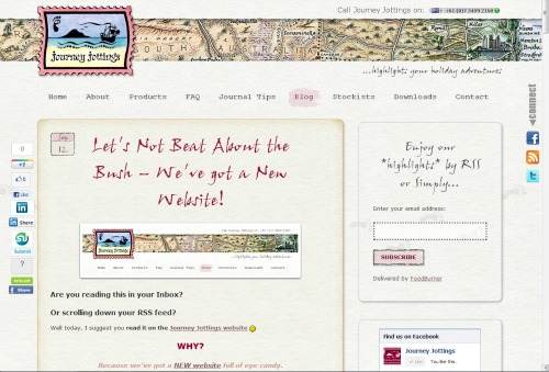
 This week (if you’re not already here) 😉
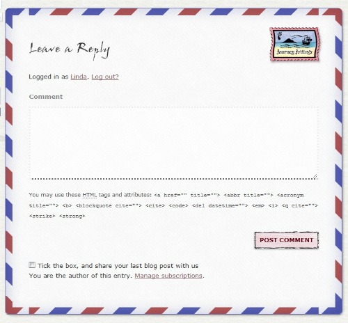
And I possibly shouldn’t spoil the surprise, but if you want to leave a comment at the bottom, this is the aerogramme you’ll have the fun of posting 🙂
Of course I’d love to take all the credit for this transformation, but I’ll fess up and share the glory with Simon who not only designed the quietly sophisticated layout that reflects our brand but also developed all the whizz bang widgets and pretty painterly buttons for us to enjoy pressing.
Scroll on down & post us a comment telling us
what do *you* think of the new design? 🙂






Great job Linda – I love the new look and it makes a lot of sense that site visitors don’t get lost on their way to buy a map!
That’s too funny Helen – I hadn’t thought of it like that
Pleased you found your way here 😉
WOW! Love your new site Linda. It feels like I’m on holidays 🙂
Looks fabulous and much easier to find my way around all of your great products.
This comments box is fun. Well done.
Thanks Suellen –
Feeling like being on holidays is the best 🙂
Fantastic…awesome…love the new layout Linda – love how it takes you on a journey with your products displayed all the time in the header and so easy to navigate…well done 🙂
Not being able to find a post or a page on a site more than a fluky first is a pet peeve of mine, so having no information more than a couple of clicks away was a major criteria –
Great to hear its working 🙂
Such an exciting, adventurous encouragement to help me think about my next venture.
Beautifully done, Linda.
Lovely to hear you think it looks as beautiful as I do (proud parent LOL)
Love the new look!
The buttons on the sides make connecting so much easier!
Congratulations, Journey Jottings… a gorgeous new site.
Thank you Sally ~
Tried to do everything with *you*, the visitor in mind 🙂
A wonderful example of a true, user-friendly website! Congratulations, Linda. 🙂
Appreciate the compliment –
Thanks for dropping by Robin 🙂
LOVE the aerogramme reply! It all looks absolutely brilliant!
Posting your comment via an aerogramme is fun isn’t it!
Loving the new look I have to say – and even more so the functionality…
Thrilled with the outcome 🙂
Love it! It all works beautifully and seamlessly together, and is clear & easy to navigate!
Hope the readers (if any!!) who find their way here from my White Cliffs scenic loo post appreciate it too!!
PS Maybe it’s just me, but is the ‘add post’ thing at the end of the comments working?
So pleased you like it 🙂
Love your Ozzie scenic dunny posts – what an auspicious place for my Map Journals to get a mention!
Love hearing about your Journey Jottings sighting as you travel –
It would make a great guest post if you’d like to collate them!
PS Sorry the ‘sharing your blog’ link didn’t work for you – I’m onto it 🙂
Hi Linda, love the clean new look. Much classier and more exciting too. Especially the comments box and especially now you’ve used my suggestions to make it even better;)
Really excited that this is a new beginning for you and look forward to hearing about the increase in sales which I’m sure will come.
Nice job sista;)
Thanks so much for your support Annabel and your great suggestion to differentiate the fields better in the comments box (now implemented)
Will keep you posted on how people respond –
Hopefully ‘off to Great Places… off and away!’ 😀